Colour Theory in Art Selection: A Practical Guide for Designers
November 2025
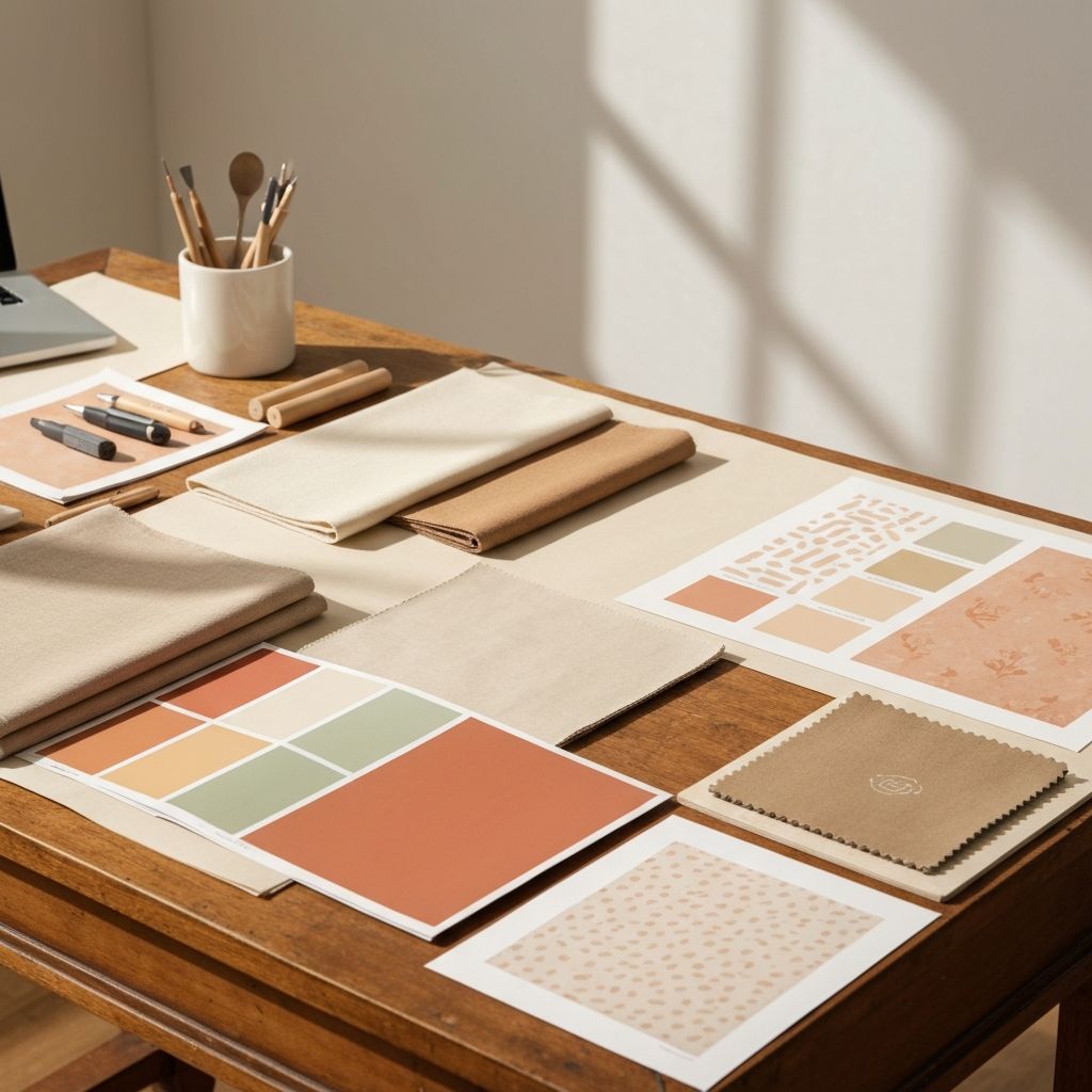
While art selection involves subjective aesthetic judgement, colour theory provides an objective framework for understanding why certain combinations work and others create visual discord. For designers seeking to create harmonious interiors, a working knowledge of colour relationships is invaluable when curating photographic art.
Beyond Colour Matching
The instinct to match artwork colours exactly to interior elements often produces underwhelming results. Successful art integration typically involves tonal relationships rather than exact matches. A warm-toned architectural photograph might complement a cool grey interior precisely because it provides contrast, not because it matches.
Consider the undertones present in both the space and the artwork. My photography tends toward warm undertones, cream whites rather than blue whites, which pairs naturally with natural materials like timber, linen, and stone while providing gentle warmth in cooler palettes.
Value and Contrast
The lightness or darkness of an image relative to its surroundings determines its visual weight. A predominantly light photograph against a light wall creates a subtle, ethereal effect, while the same image against a darker wall becomes a focal point with defined edges.
The Architecture collection includes works spanning a range of tonal values, from high-key Mediterranean scenes to dramatic shadow studies, allowing designers to select based on the desired contrast relationship.
Temperature and Atmosphere
Colour temperature profoundly influences spatial perception. Warm colours advance and create intimacy, while cool colours recede and suggest expansiveness. Photographic art can be used strategically to adjust perceived temperature and spatial quality.
For Designers
Trade enquiries welcome
I offer trade pricing and consultation services for interior designers seeking to incorporate photographic art into client projects.
Contact for Trade EnquiriesSaturation and Sophistication
Highly saturated colours demand attention and can overwhelm in large format. My work deliberately employs muted, naturalistic saturation that integrates seamlessly into sophisticated interiors without competing with other elements. This restraint allows the imagery to enhance rather than dominate.